
Texto: Fernanda Rodríguez (@ferrodriguezcal)
Todos hemos escuchado acerca del famoso color del año. Incluso si no escuchado, sin duda lo has visto o hasta comprado, formando parte de este concepto del mundo del diseño sin siquiera saberlo. Pero algo muy curioso de este concepto es que, la mayoría, lo encontramos bastante inútil si no conocemos su significado o propósito. ¿Alguna vez te lo has cuestionado?
No hay duda de que el color es un factor importante en la decisión de compra, y esa importancia le ha dado mucho más que solo categoría, le ha dado poder. Poder que le ha permitido convertirse en una industria multimillonaria, independiente, y más bien de la que dependen, industrias como la moda, el diseño, la tecnología, la arquitectura y hasta el automovilismo.
Todas las industrias que se te ocurran están pensando todo el tiempo en colores. Sobretodo, en qué colores vas a querer tú como consumidor, osea, en tendencias de color. Estos son los pronósticos de los colores que la sociedad va a preferir en determinado momento.
Y el color del año, ¿Qué es?
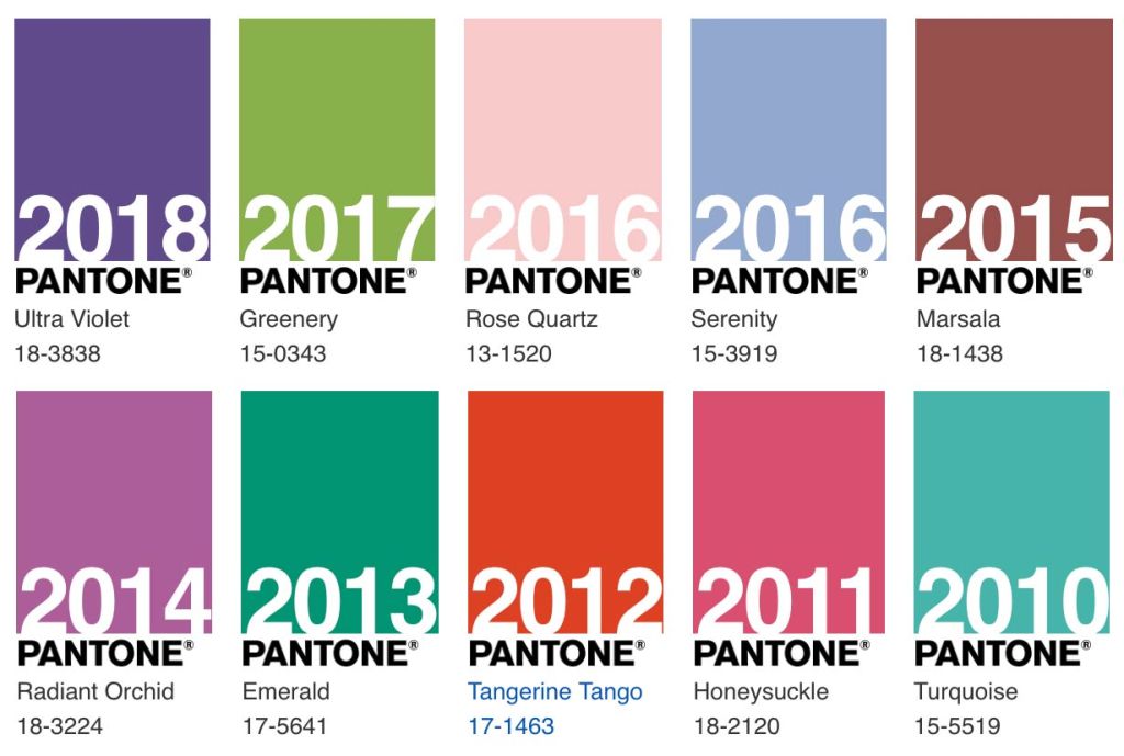
Pues resulta que en el 2000 al Instituto del Color Pantone se le ocurrió un concepto maravilloso de branding, marketing y diseño creativo: Establecer un color que definiera y reflejara lo que pasa en el mundo y en la cultura cada año. Desde entonces, muchas otras compañías sacan su color del año también, el de Pantone es simplemente el más sonado por su peso en la industria general del color.
¿Cómo lo eligen? Te estarás preguntando.
En palabras de la misma Leatrice Eiseman, Directora Ejecutiva de Pantone:
“Exploramos todo el mundo en busca de nuevas influencias de color. Esto incluye a la industria del entretenimiento y películas, colecciones de arte y nuevos artistas, moda, todas las áreas del diseño, destinos de viaje, estilos de vida y juegos. Las influencias también pueden provenir de nuevas tecnologías, materiales, texturas e incluso eventos deportivos que capten la atención mundial».
Por lo tanto, el trayecto de este concepto es completamente cíclico. Surge de las personas para posteriormente, influenciarlas. Afecta y se ve afectado por las tendencias del momento, por lo que es tanto una observación del estado del mundo como un factor de influencia para el próximo año. Con valores filosóficos y comerciales al mismo tiempo.

Y ahora sí entonces ¿A quién le importa?
Hay una escena en la película The Devil Wears Prada en la que Miranda Priestly le explica a Andy el fenómeno del color en los productos de consumo. Pone de ejemplo su suéter azul, explicándole cómo éste no solo es azul, es un tono específico de azul que entró a las colecciones de pasarelas 4 años antes para después abrirse camino en colecciones de más y más diseñadores, de ahí a grandes almacenes y de ahí al armario de Andy, que, sin saber ni darle importancia, termina formando parte de esta cadena. «Ese azul representa millones de dólares e innumerables empleos» dice Priestly.
Algo así funciona en el mundo real. La selección anual de colores de Pantone y de otras empresas de pronosticación de tendencias, está lejos de ser un ejercicio intrascendente o superficial. Éste tiene un impacto financiero y cultural. Es, por un lado, una herramienta de marketing en el sentido de que el color aumenta producción y ventas. Los colores pronosticados sirven a los diseñadores y creativos de las industrias como inspiración sobre el estado de ánimo de la cultura global, por lo que acabarán inevitablemente en los hogares, armarios, películas, muebles, zapatos y hasta celulares de las personas.

Pero más que ver este color cómo la característica obvia a incluir en un producto, anuncio o diseño, este debe ser entendido como una señal abstracta de lo que necesitan las personas. Una especie de instantánea a color sobre todo lo que está pasando en la cultura. Una interpretación de los sentimientos de la humanidad a través de un color. A lo mejor es porque soy muy idealista pero para mí, no se trata sólo de marcar una tendencia comercial sino de, a través de psicología y teoría del color, representar el zeitgeist (espíritu de la época) del mundo.
Y si te interesa saber cómo los expertos ven el 2021, te dejo mis dos pronósticos preferidos…
- Color del año de Pantone: https://www.pantone.com/eu/es/color-of-the-year-2021
- Color del año de WGSN: https://www.wgsn.com/blogs/a-i-aqua/
Who cares about the color of the year?
Text: Fernanda Rodríguez (@ferrodriguezcal)
We have all heard about the famous color of the year. Even if you haven’t heard it, you probably have seen it or even bought it, becoming part of this design concept without even knowing it. But something very funny about this concept is that most of us can find it quite useless if we do not really know its meaning or purpose. Have you ever questioned it to yourself?
There is no doubt that color is a very important driver in a purchase decision, and the thing is that such importance has not only given it level, it has given it power. Power that has allowed it to become a multibillion-dollar industry, independent, and rather on which they depend, industries such as fashion, design, technology, architecture and even cars.
Every industry you can think of is reflecting on color all the time. Especially in what colors are you going to want as a consumer, that is, color trends. These are the forecasting of colors that people will prefer at a certain time.
And the color of the year, what is that?
It all goes back to the year 2000, when the Pantone Color Institute came up with a wonderful concept of branding, marketing and creative design: Establishing a color that would define and reflect what is happening in the world and culture every year. Since then, many other companies have released their color of the year as well, Pantone’s is simply the most famous one because of the importance they overall have in the color industry.
And how do they choose it? You may be wondering.
In the words of Leatrice Eiseman (Pantone’s Executive Director) herself:
“[We] comb the world looking for new color influences. This can include the entertainment industry and films in production, traveling art collections and new artists, fashion, all areas of design, aspirational travel destinations, as well as new lifestyles and play styles. Influences may also stem from new technologies, materials, textures…and even upcoming sporting events that capture worldwide attention.”
Hence, the journey of this concept is completely cyclical. It arises from people to later influence them. It affects and is affected by the trends of the moment, making it both an observation of the world and an influencing factor for the upcoming year. With both philosophical and commercial values at the same time.
But now, who cares then?
There is a scene in the movie The Devil Wears Prada in which Miranda Priestly explains to Andy the matter of color in consumer products. She gives her an example using her blue sweater, explaining how it is not only blue, but a specific shade of blue which had entered catwalk collections 4 years earlier to later find its way into collections of more and more designers, then into department stores and finally ending up in Andy’s wardrobe, whom, without noticing or giving it importance, ended up being part of this value chain too. «That blue represents millions of dollars and countless jobs.» Priestly says.
The real world works in a similar kind of way. The annual selection of colors from Pantone and other trend forecasting companies are far from being an unimportant or vain attempt. They have a big financial and cultural impact. On one hand, they’re a marketing tool, in the sense that color increases production and sales. Colors of the year serve designers and industry creatives as inspiration for setting and understanding the global culture’s mood, so they inevitably end up in people’s homes, furniture, movies, shoes, clothes and even cell phones.
But beyond seeing this color as just the obvious element to include in a product, advertisement or design, it must be understood as an abstract sign of what people need. Something like a color snapshot of everything that is happening in culture at the moment. An interpretation of the feelings of humanity through a color. Maybe it’s just because I’m a very idealistic person but for me, it’s not just about setting a commercial trend but instead it’s about going through psychology and color theory to represent the zeitgeist (spirit of the time) of the world.
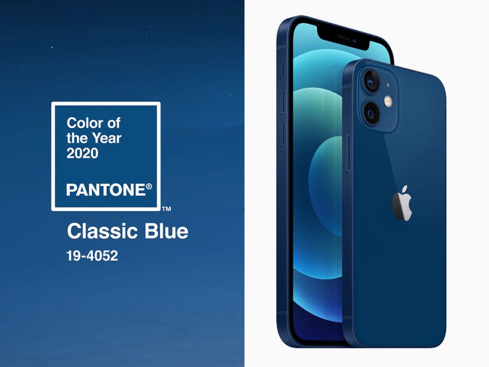
And if you are interested in knowing how the experts see 2021, I’ll leave you with my two favorite forecasts…
- Pantone Color of the Year: https://www.pantone.com/eu/en/color-of-the-year-2021
- WGSN Color of the Year: https://www.wgsn.com/blogs/a-i-aqua/

Qué interesante post! 🙂 A mi definitivamente ya me importa el color del año.
Me gustaLe gusta a 1 persona